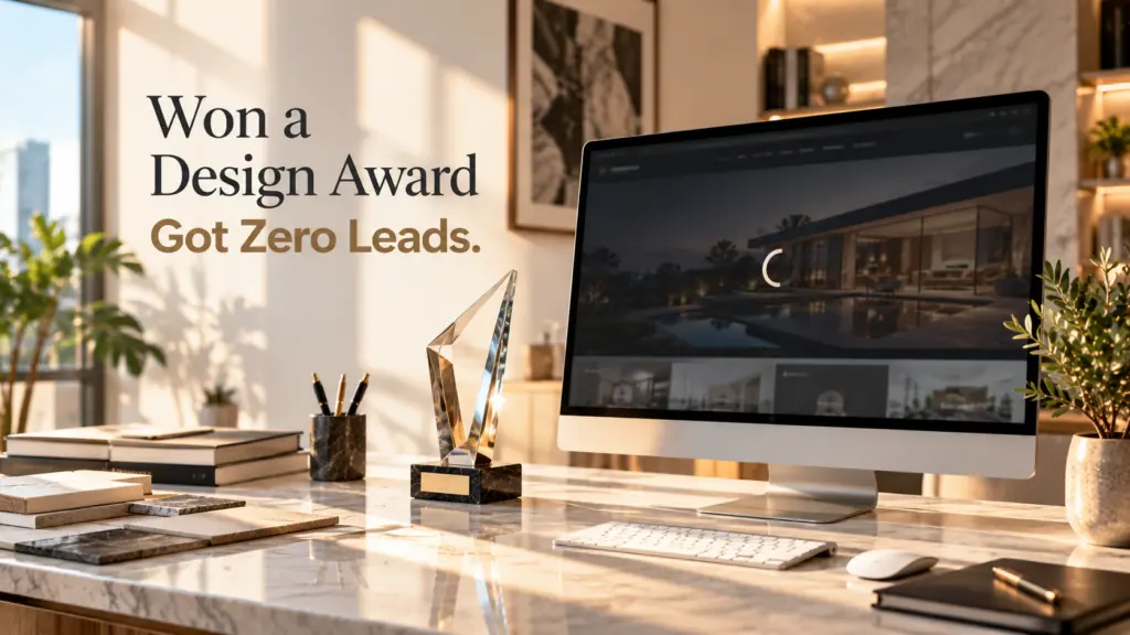
The first thing the owner showed me was not the website. It was a design award badge. A boutique interior studio, a beautiful site with full-screen video, slow elegant fades and a font that probably cost more than my first laptop. Then he said the part that made him call me: “We get around 2,000 visitors a month and maybe one enquiry. Sometimes none.”
This is the clearest example I have of why beautiful websites don’t convert. Nothing was broken. The site was doing exactly what it was designed to do: impress. It was just never designed to sell.
What I saw in the first five seconds
I opened the site on my phone, the way most of his visitors did. Here is what a visitor saw in the first five seconds:
- A loading animation, then a slow video of a living room.
- The word “Timeless” in very large letters.
- A small arrow pointing down.
No word about what they do, where they work, what it costs or how to start. A visitor arriving from Google with a real project in mind had to guess. Most of them did not guess. They left.
Design gets attention. Answers get clients.
Rayhan Chowdhury
The real reason beautiful websites don’t convert
Every visitor arrives with one silent question: “Can these people solve my problem better than anyone else?” A beautiful website answers a different question: “Do these people have taste?” Taste matters, but it is not why someone fills in a form.
When I checked the analytics, the pattern confirmed it. Most visitors never scrolled past the video. The contact page had a lot of views and almost no submissions, because the form asked for nine fields, including “budget” with no ranges to choose from. People who were interested still could not find a reason to act.
What we changed, step by step
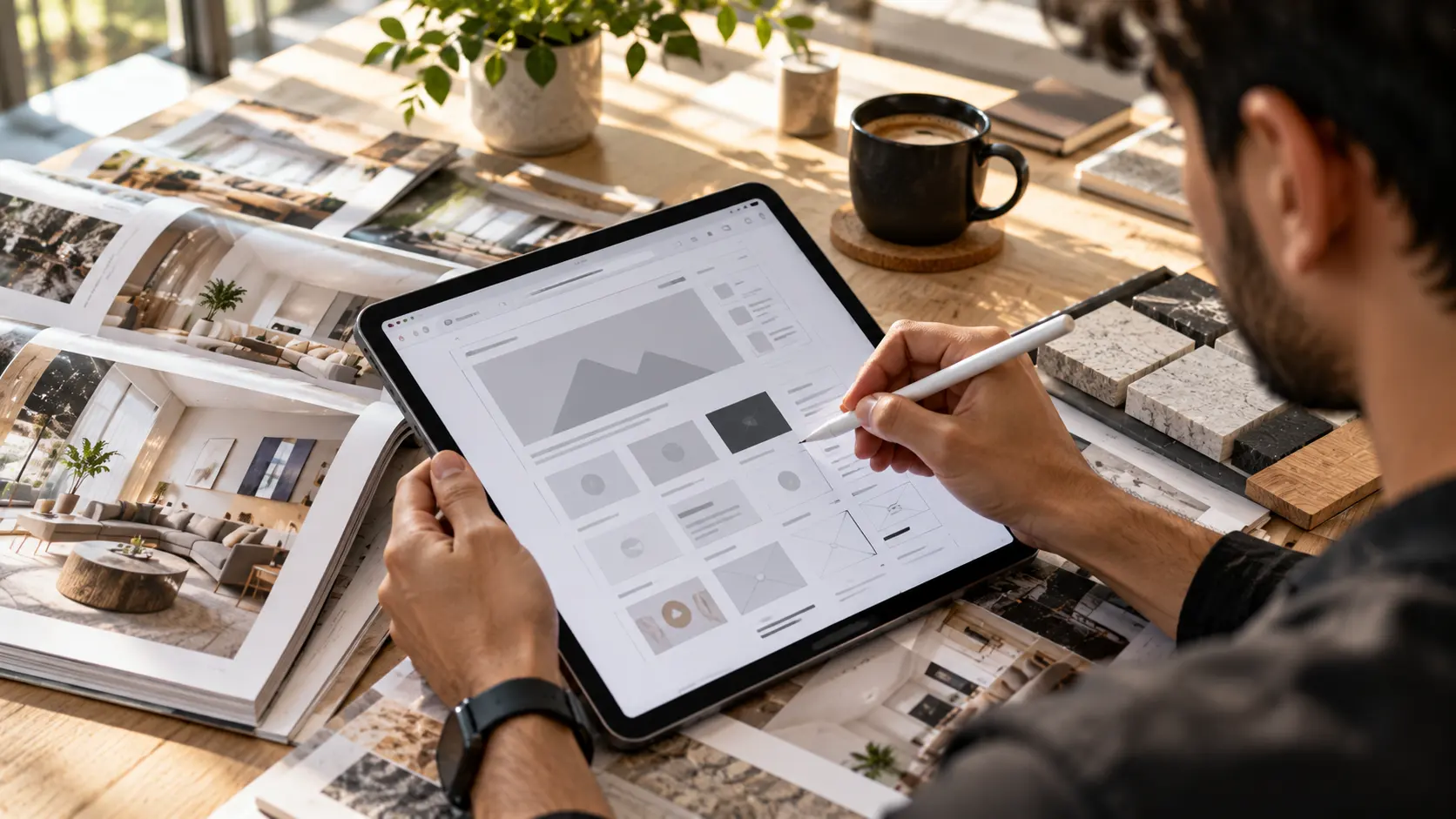
1. The headline started doing the selling
“Timeless” became “Interior design for apartments and villas in Lake Como, from first sketch to final styling.” Boring? A little. But now a visitor knows in three seconds if they are in the right place. The beautiful video stayed, it just moved behind the words instead of replacing them.
2. Proof moved next to the button
The studio had great projects hidden three clicks deep. We put two of them, with before and after photos and a one-line result, directly under the hero. Proof works best right where the decision happens.
3. One clear next step
The old site had “Contact”, “Get in touch”, “Say hello” and “Enquire” all leading to different places. We replaced them with one action, “Book a free design call”, repeated in the same words across the site.
4. The form got shorter and friendlier
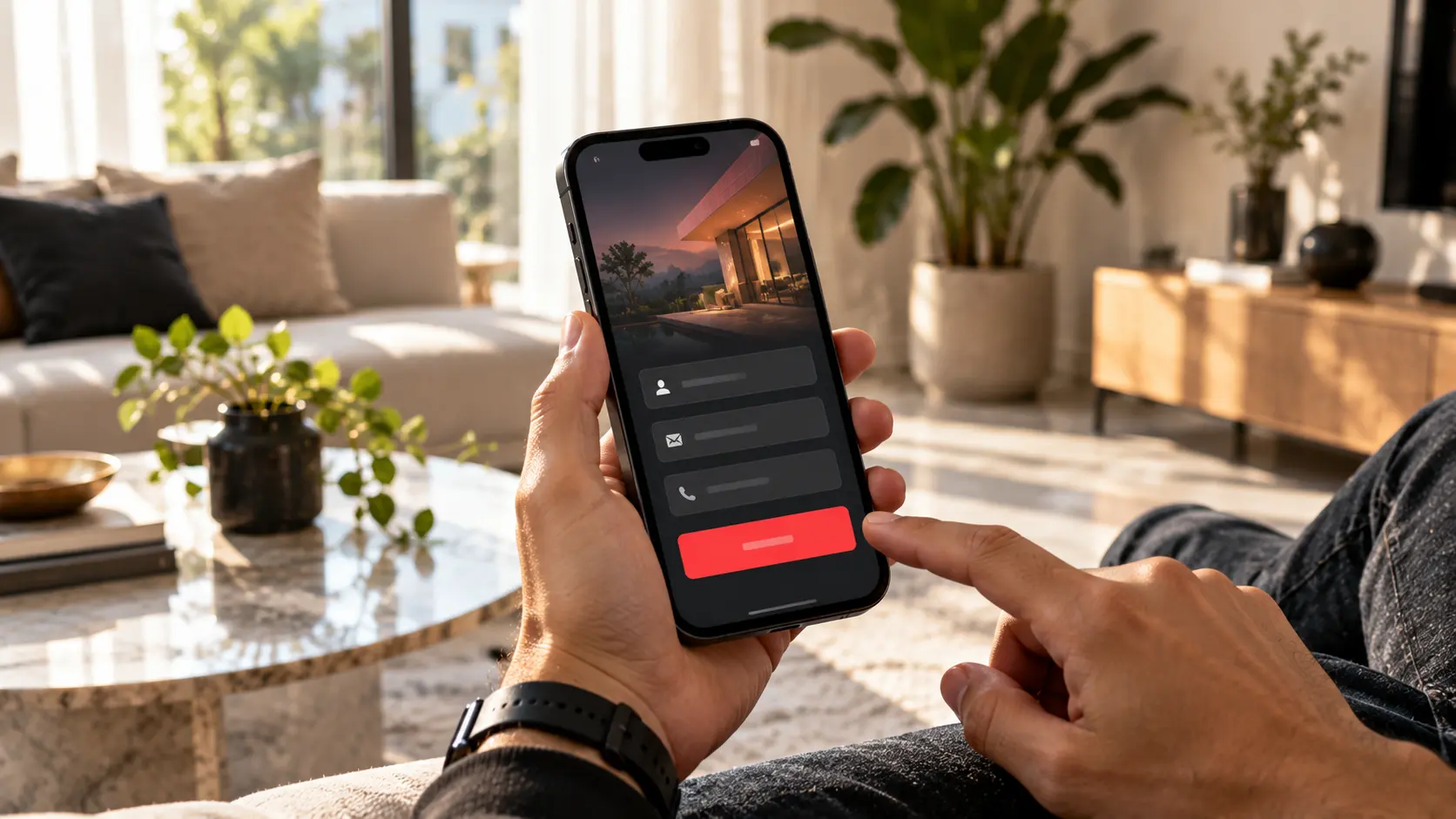
Nine fields became four: name, email, type of project and a budget range with simple options. On homepage conversion projects this is often the single biggest win. Every extra field is a reason to stop.
5. Speed came before effects
The video was 14 MB. On a phone it took several seconds before anything appeared. We compressed it, loaded a still image first and removed three animation libraries. The site still felt premium, but it was usable on a train. If speed is your issue, my WordPress speed story walks through the same process.
What happened after launch
We did not touch the traffic. Same visitors, same ads, same SEO. Within the first month enquiries went from one or two to a steady flow every week, and they were better enquiries because the budget ranges filtered out people looking for a cheap makeover. The award badge is still on the site. It just is not doing the selling anymore.
A ten-minute test for your own website
Open your homepage on your phone, set a timer for five seconds and ask a friend these questions:
- What does this business do?
- Who is it for?
- Why should I trust them?
- What should I do next?
If they cannot answer all four, you have found the reason your website is not getting leads. Good conversion rate optimization usually starts here, not with fancy tools. The research from Nielsen Norman Group on how quickly people leave web pages explains why those first seconds matter so much.
The conversation that changed the project
Halfway through our first call, the owner said something I hear a lot: “But our clients are design people. They want to see beautiful work, not sales copy.” I asked him to read me the last three enquiries he had received. All three asked the same things: do you work outside the city, roughly what does a full apartment cost, and how long does it take.
None of those answers were anywhere on the website. His clients did love beautiful work. They also had a budget, a deadline and a husband or wife asking “how much is this going to cost us?” The website had to answer both sides: the emotional one with the photos, and the practical one with clear information.
Why designers and owners fall into this trap
I do not blame the designer who built the original site. Awards, portfolios and social media reward what looks impressive in a screenshot. Nobody gives out prizes for a clear headline or a short form. So websites slowly drift towards being art pieces, and the business owner assumes the lack of leads is a marketing problem.
It is usually not. When I audit a quiet website, I almost always find the same three gaps: the visitor does not understand the offer fast enough, there is no proof near the decision point, and the next step is either hidden or scary. Fix those three and the same traffic starts behaving differently.
What I kept, and why
A redesign that throws away everything is a mistake too. We kept the photography, the colour palette and the overall calm feeling, because they were part of why the right clients trusted the studio. We just gave them a job. The video now plays behind a clear headline. The gallery now has captions that explain the brief, the budget range and the result. The about page now shows the people behind the work, which matters a lot when someone is about to let a stranger redesign their home.
Good conversion work is rarely about making a site uglier or louder. It is about making every beautiful element answer a question the visitor already has.
Small details that made a big difference
- A price range on the services page. “Full apartment projects usually start from…” Scary for the owner, reassuring for the client.
- A “what happens after you contact us” section. Three short steps, so the visitor knows the call is free and relaxed.
- A real phone number in the header. Some clients still prefer to call, especially for bigger projects.
- Testimonials with full names and project locations. Anonymous quotes are easy to ignore.
None of these changed the look of the site. All of them changed how many people decided to reach out. If you are curious how I approach this from the first draft, the process page walks through each step.
Why beautiful websites don’t convert on mobile even more
When I split the studio’s analytics by device, the gap was bigger than I expected. On desktop, a few visitors at least scrolled to the projects. On phones, almost nobody did. The full-screen video took the whole first screen, the menu was hidden behind an icon and the contact link sat at the very bottom of a long page. That is another reason why beautiful websites don’t convert: they are usually designed and approved on a large monitor, then visited on a phone.
We rebuilt the mobile version as its own experience, not a squeezed desktop. Shorter headline, a still image instead of the video, the two best projects as swipeable cards and a sticky “Book a free design call” button at the bottom of the screen. Mobile enquiries were the first number to move after launch.
A quick way to explain this to your designer
If you work with a designer and want to raise this without starting a fight, ask one question: “What should a visitor do in the first ten seconds, and how does the design help them do it?” A good designer will have an answer. If the answer is only about mood and feeling, that is your sign. Beautiful websites don’t convert by accident, and they don’t fail by accident either. Both come from what the team decided the page is for.
Questions I hear a lot
Does this mean design does not matter?
Design matters a lot. It builds trust and makes your offer feel valuable. It just has to support a clear message, not replace it.
Do I need a full redesign?
Rarely. Most of the changes above took days, not months. Rewriting the hero, moving proof up and simplifying the form often gets you most of the way.
How do I know it worked?
Count enquiries per 100 visitors before and after. If that number goes up, the site is selling better, even if traffic stays the same.
Want me to look at yours?
If your website looks great but stays quiet, I can tell you why in one short review. This is what my conversion website service is built around: making good-looking sites actually bring in clients. Request a project review and I will send you an honest list of what to fix first.