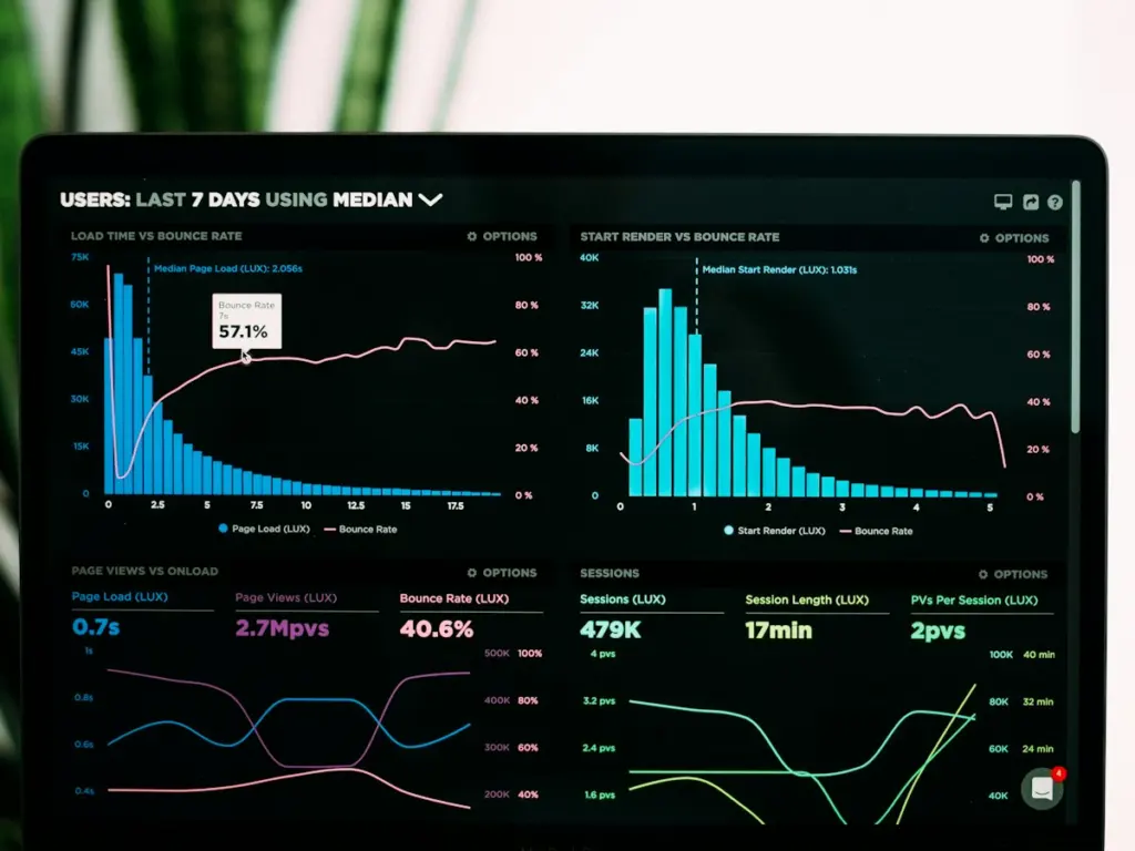
ReviveFlows had a solid product but a homepage full of jargon. Visitors arrived from ads, read three paragraphs and still did not know what problem it solved.
02
The approach
Rewrote the headline around the outcome, not the features.
Replaced static screenshots with a short interactive demo.
Cut the signup form from nine fields to two.
Built pricing that answers “which plan is for me” instantly.
03
What I built
A lightning fast marketing site with an interactive product tour, comparison pages for SEO and a two-field trial signup connected to the app.
Results
What changed after launch
2.6xtrial signups
54%longer time on page
1clickto start trial
98PageSpeed score
Inside the project
Screens from the build
“He thinks like a marketer and builds like an engineer. Rare combination.”